DHC – Brand Identity
Agency: One & Only
Client: DHC
Design Direction: Alice McKeown
Creative Direction: Pearl Delaney-Girdlestone
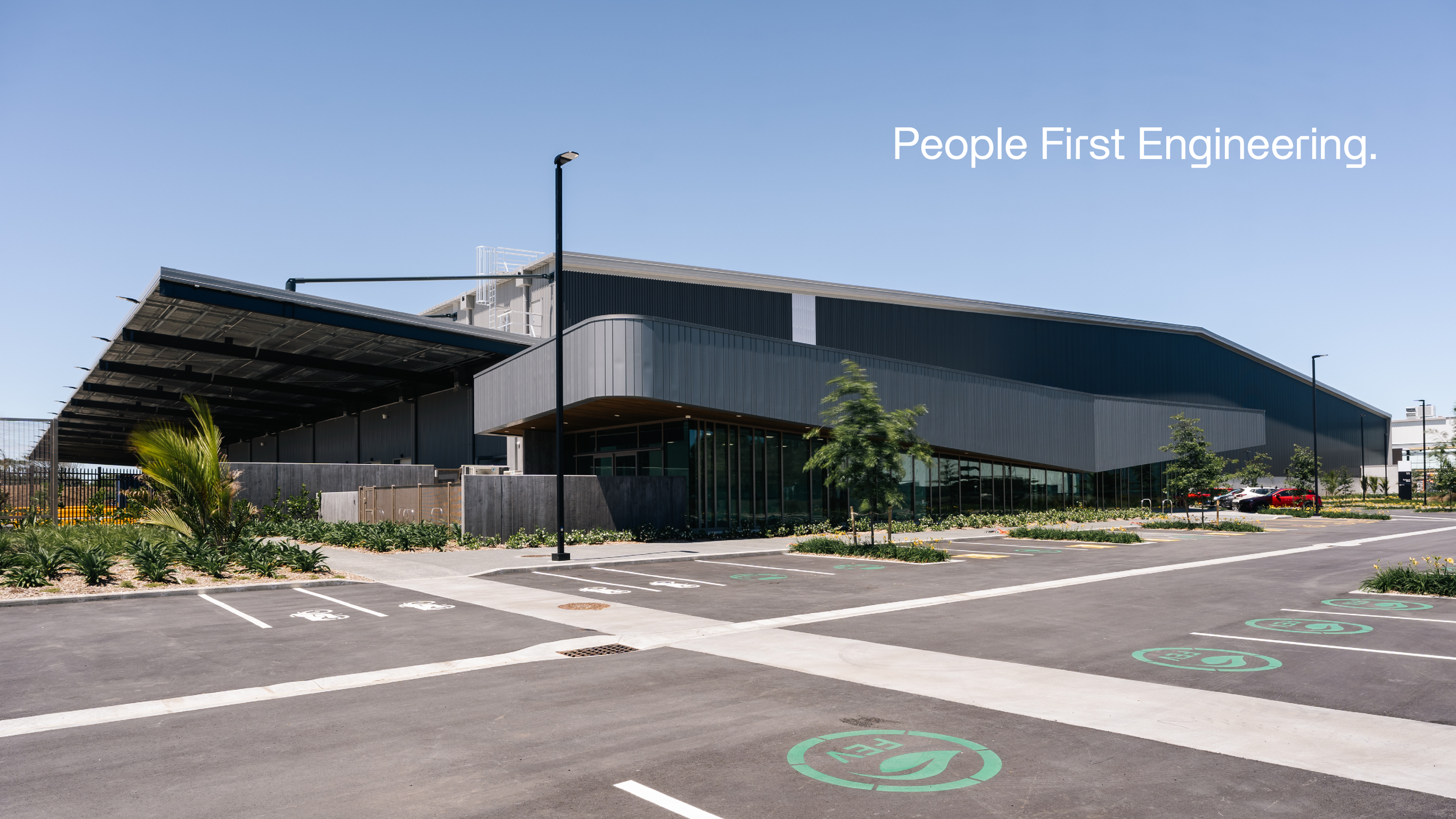
People First Engineering.
DHC is an engineering firm with a difference.
A senior-weighted team across Civil, Structural, Residential and Fire, DHC is driven by experience, expertise and, above all, its people.
The challenge was simple: take the foundations of an existing brand and make it feel more like DHC.
Responsive. Down-to-earth. Practical. No unnecessary complexity. Just smart engineering that finds a way to make projects work.
We went back to basics, strengthening the foundations before building the identity back up.
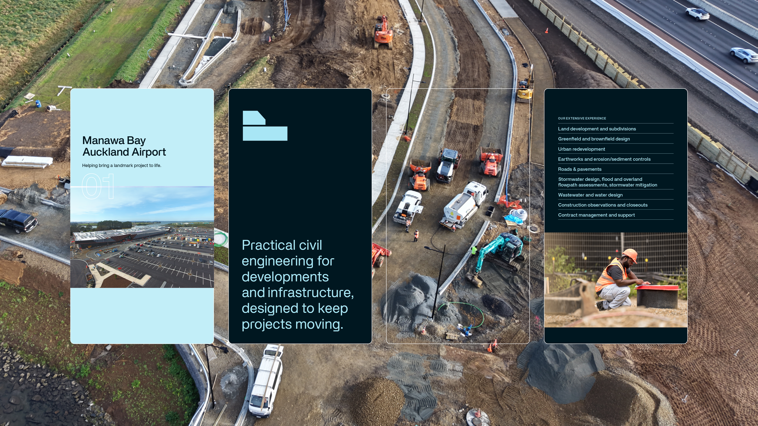
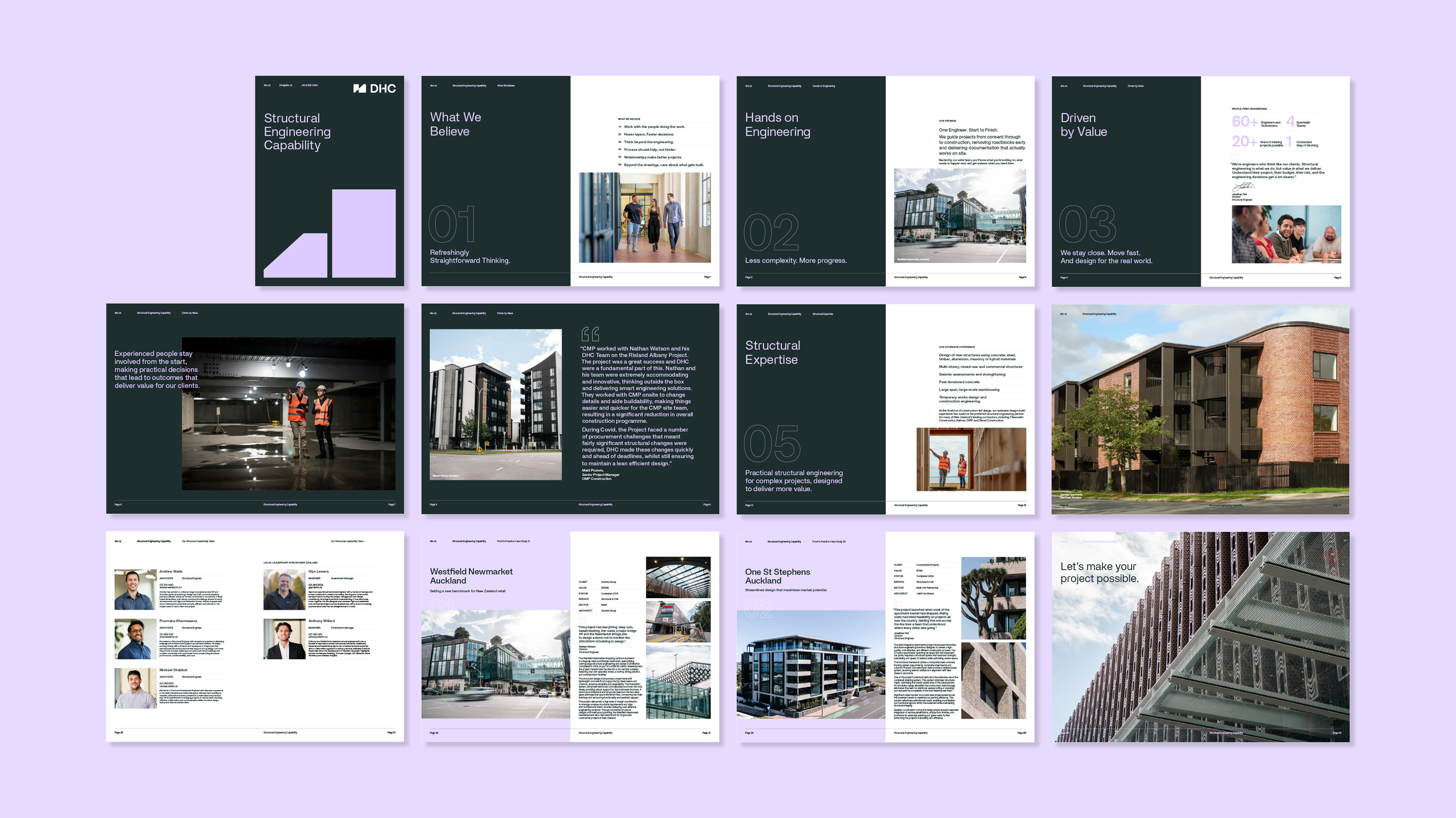
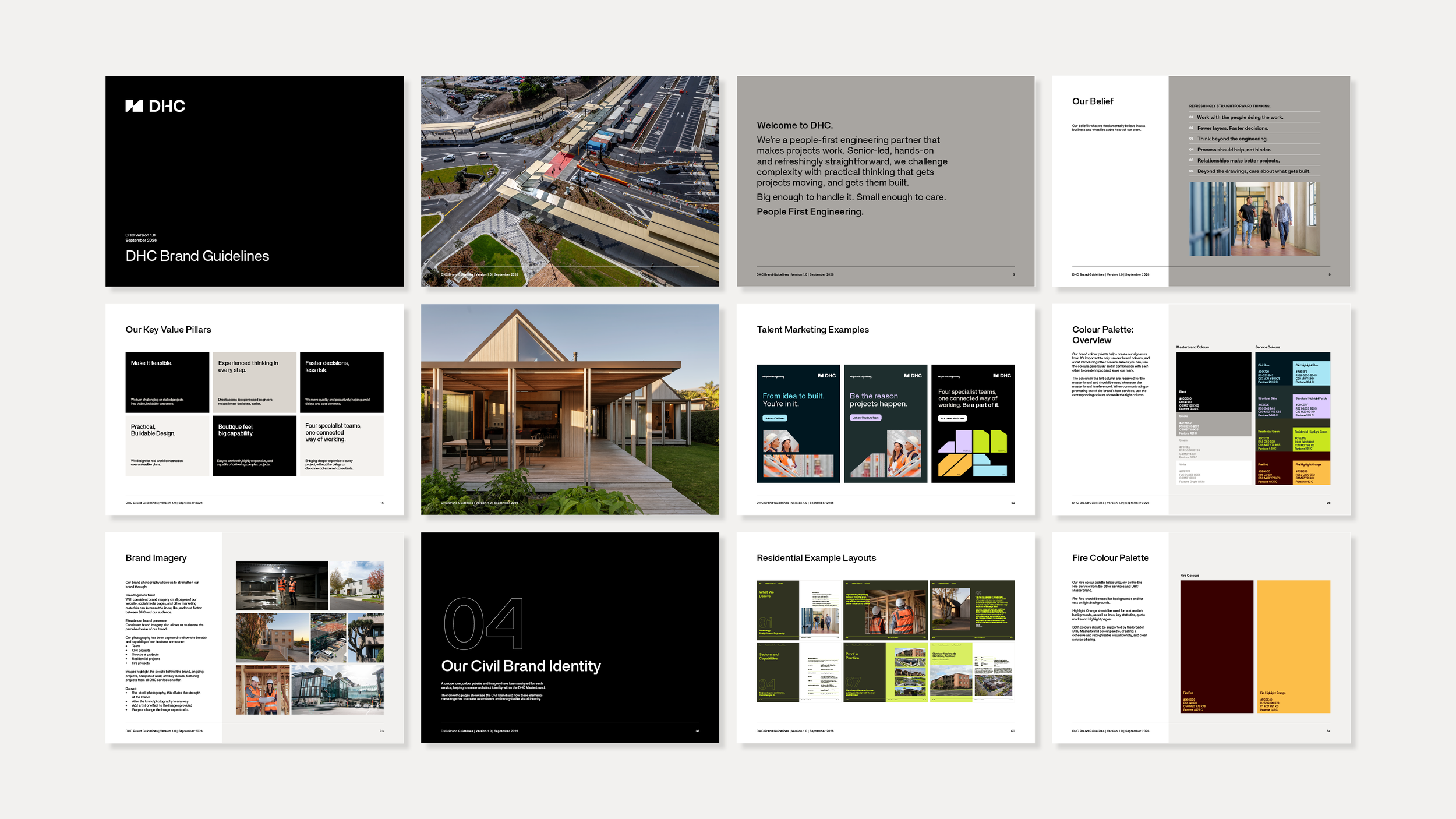
A new system of minimalist icons gives each service its own visual territory, while still sitting comfortably within the wider DHC brand. A refined colour palette, distinctive typography and confident, uncomplicated language bring consistency and character to the identity.
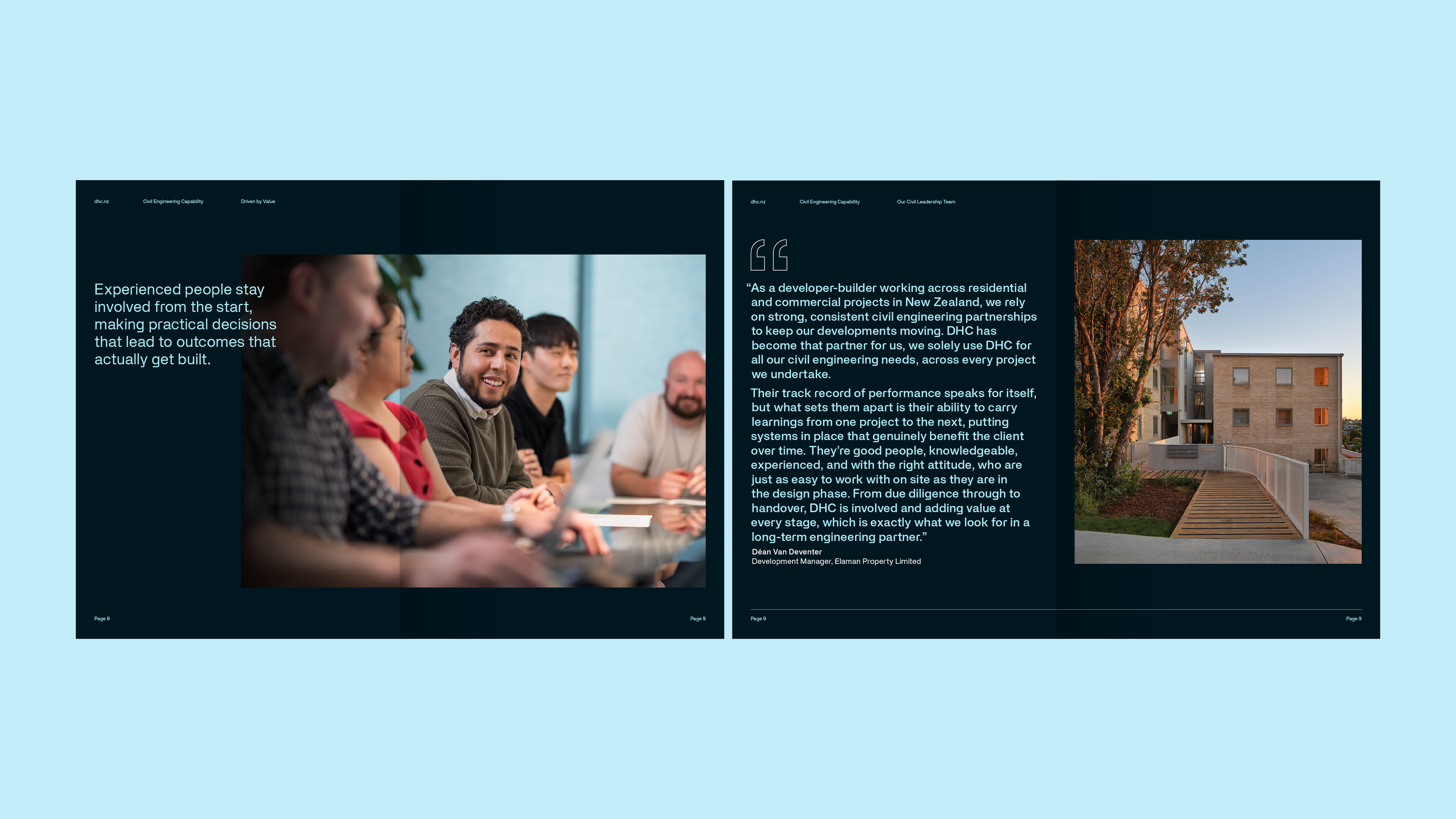
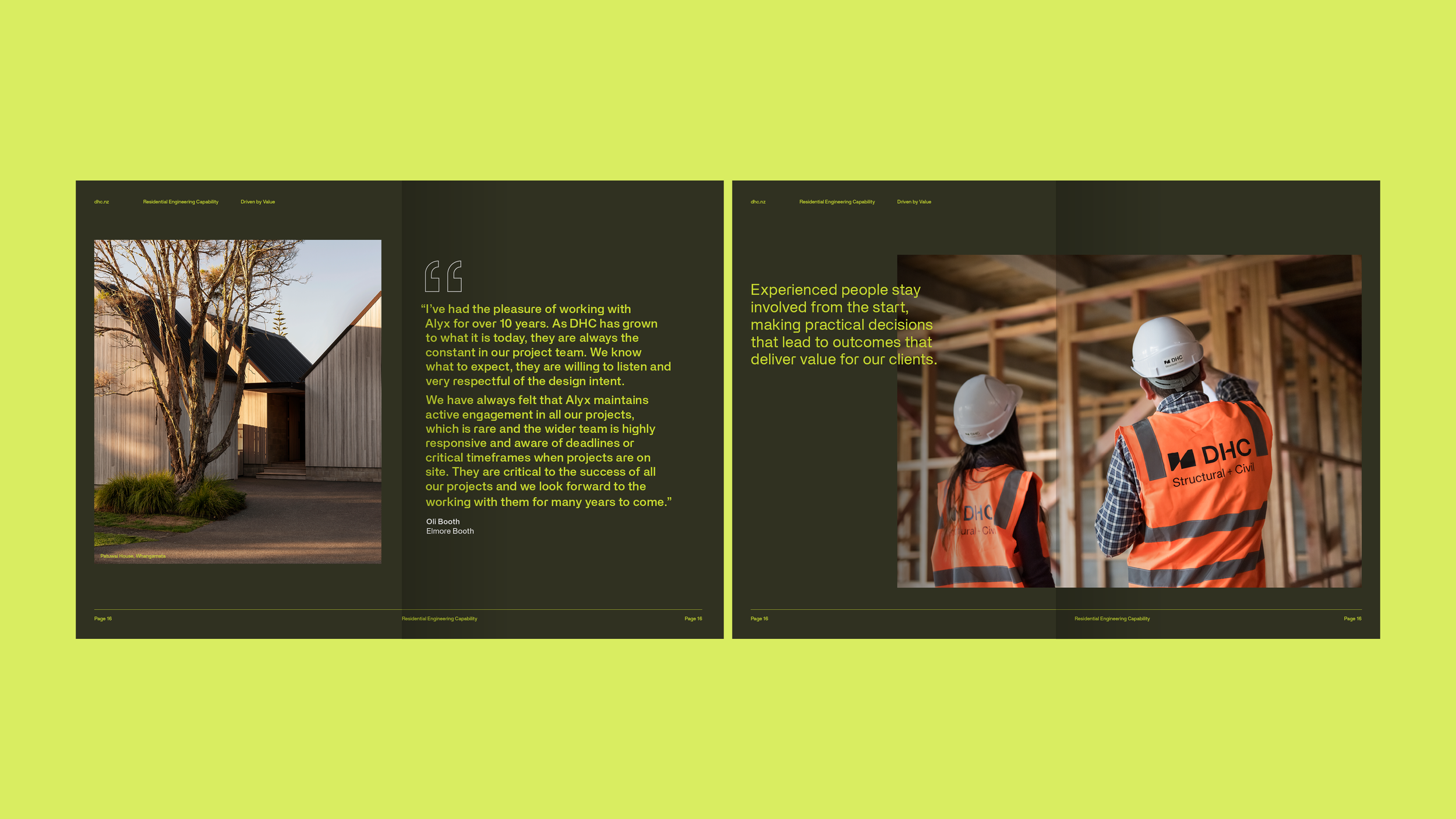
The language became a key part of the brand. Clear, direct and never overcomplicated, it reflects DHC’s approach to engineering. Client testimonials and staff voices put real people at the heart of the brand, while the scale and experience behind the business are given the space to speak for themselves.
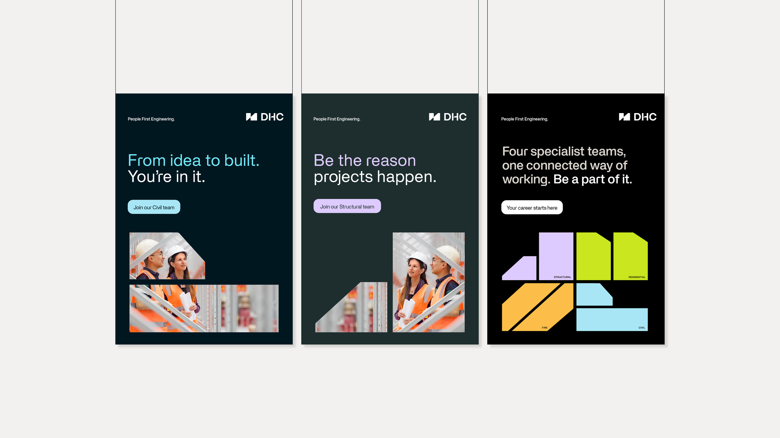
The identity also needed to look forward. DHC isn’t just attracting clients, it’s attracting the next generation of engineers. The brand needed to feel like a place talented people would want to be part of.
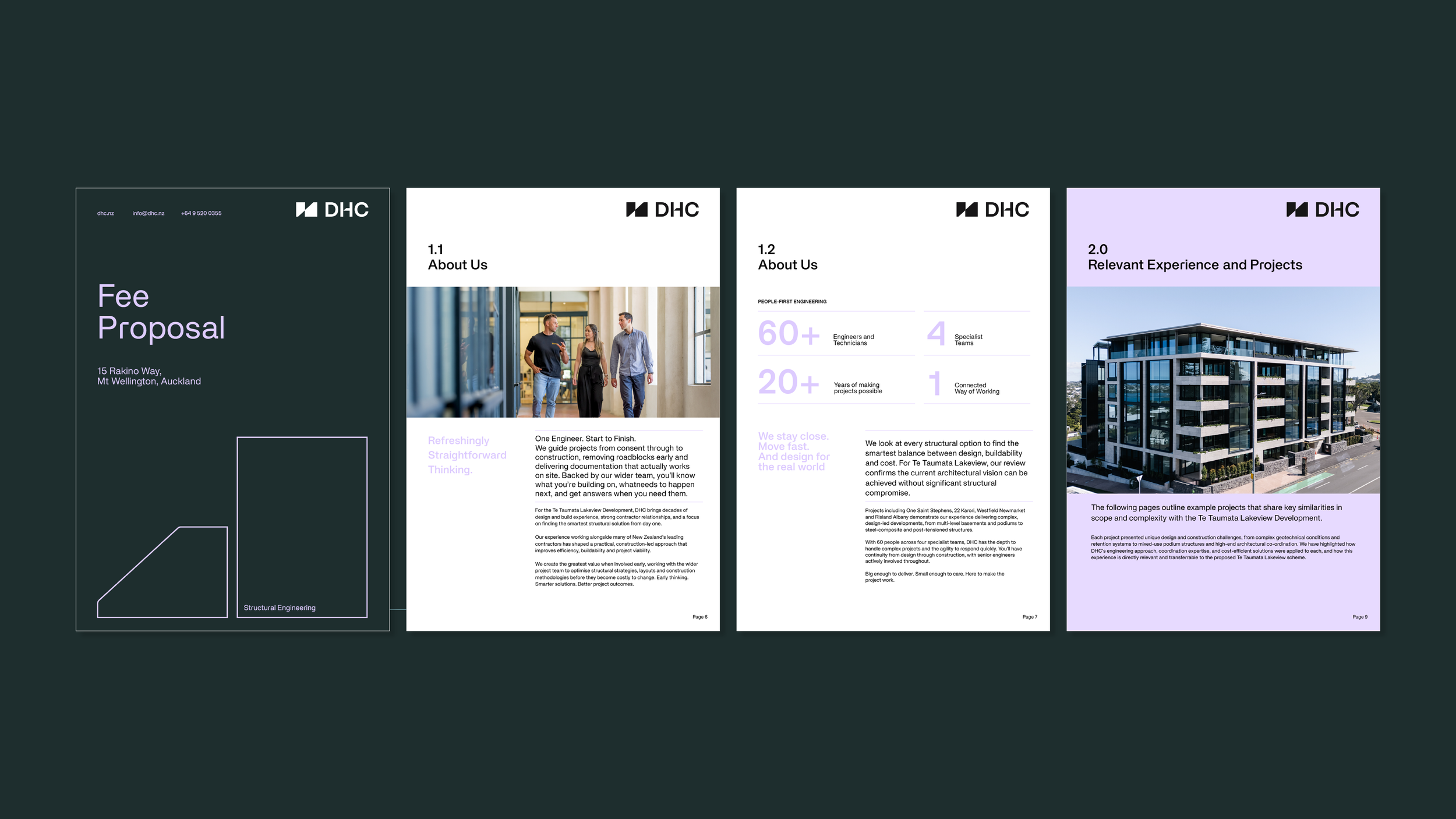
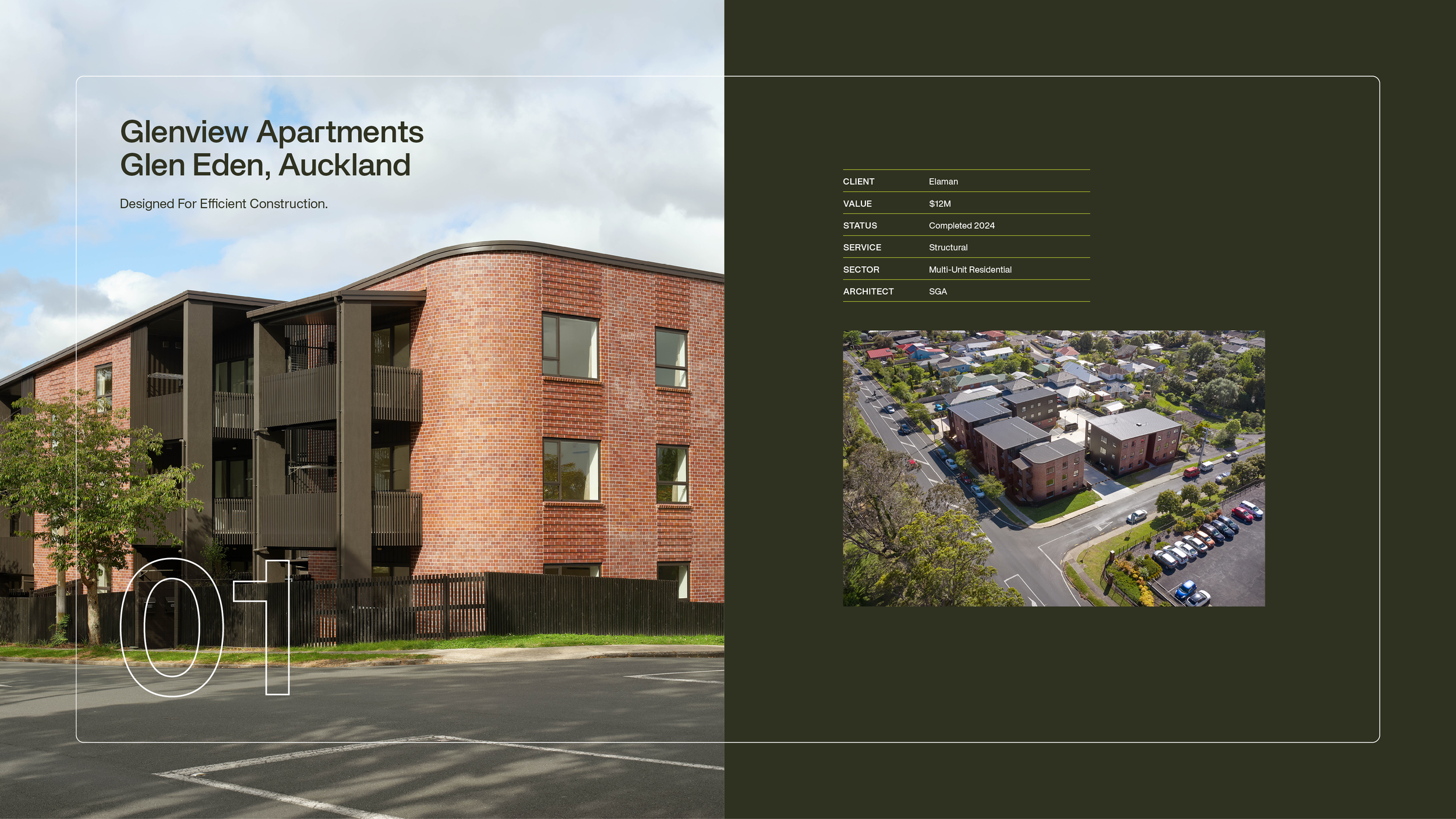
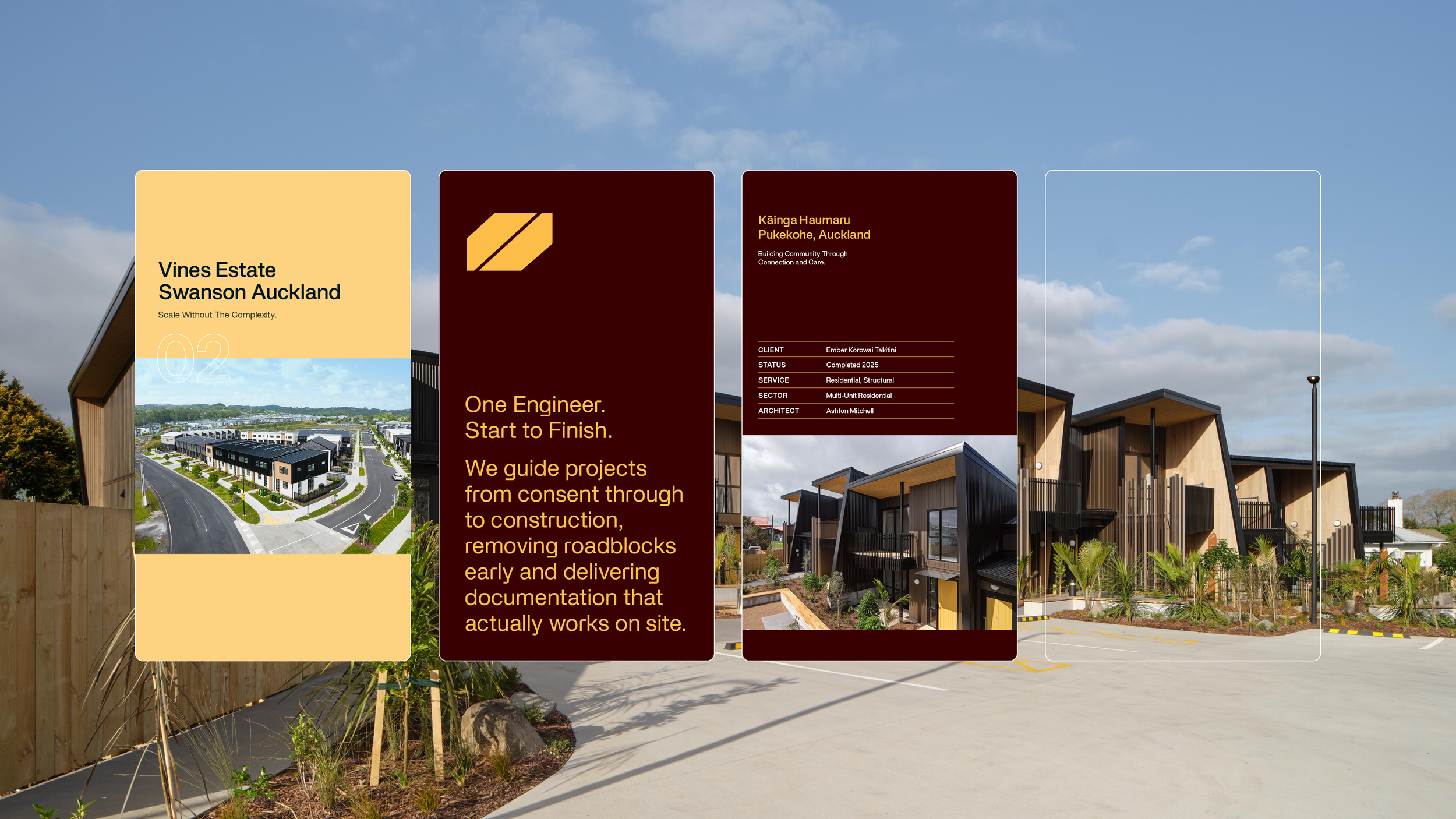
One of the biggest opportunities was bringing DHC’s four disciplines together. Individually, they each have a strong offering. Collectively, they are DHC’s point of difference. We created a unified visual system, considered colour strategy and flexible suite of templates that give each discipline its own personality, without losing sight of the bigger picture.
The result is a brand that feels unmistakably DHC. Modern. Confident. Straightforward. A brand that brings its people forward, connects its capabilities and gives the business a stronger platform for what comes next.